Tools
Below you will find write-ups explaining the various tools that have been incorporated into the NetAssess app. Explanations of how to use the apps can be found on the Help page.
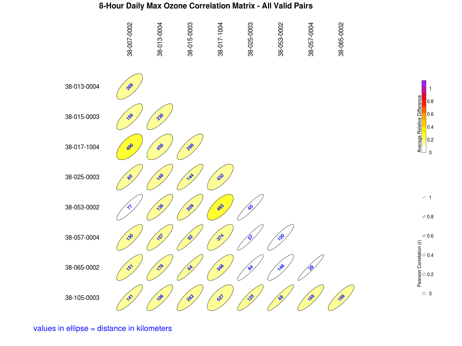
The area served tool uses a spatial analysis technique known as Voronoi or Thiessen polygons to show the area represented by a monitoring site. The shape and size of each polygon is dependent on the proximity of the nearest neighbors to a particular site. All points within a polygon are closer to the monitor in that polygon than to any other monitor. Once the polygons are calculated, data from the 2010 decennial census are used to find the census tract centroids within each polygon. The population represented by the polygon is calculated by summing the populations of these census tracts. Within the program, polygons are displayed by selecting a pollutant and area of interest, then pressing the Area Served icon ( Because census tract centroids were used to assign whole tracts to a particular Voronoi polygon, a few polygons which do not have a tract centroid within them do not have population information. If necessary, information for these cases can be estimated from the statistics of surrounding sites. The Correlation Matrix tool calculates and displays the correlation, relative difference, and distance between pairs of sites within a user selected set of air monitoring sites. Within the NetAssess App the Correlation Matrix Tool generates a graphical display and a downloadable CSV file which summarize the results for each selected site pair. The purpose of this tool is to provide a means of determining possible redundant sites that could be removed. Possible redundant sites would exhibit fairly high correlations consistently across all of their pairings and would have low average relative difference despite the distance. Usually, it is expected that correlation between sites will decrease as distance increases. However, for a regional air pollutant such as ozone, sites in the same air shed can have very similar concentrations and be highly correlated. More unique sites would exhibit the opposite characteristics. They would not be very well correlated with other sites and their relative difference would be higher than other site to site pairs. The Correlation Matrix tool generates a graphical display that summarizes the correlation, relative difference and distance between pairs of monitoring sites. Within the graphical display, the shape of the ellipses represents the Pearson correlation between sites. Circles represent zero correlation and straight diagonal lines represent a perfect correlation. The correlation between two sites quantitatively describes the degree of relatedness between the measurements made at two sites. That relatedness could be caused by various influences including a common source affecting both sites to pollutant transport caused meteorology. The correlation, however, may indicate whether a pair of sites is related, but it does not indicate if one site consistently measures pollutant concentrations at levels substantially higher or lower than the other. For this purpose, the color of the ellipses represents the average relative difference between sites where the daily relative difference is defined as: where s1 and s2 represent the ozone concentrations at sites one and two in the pairing, abs is the absolute difference between the two sites and avg is the average of the two site concentrations. The average relative difference between the two sites is an indicator of the overall measurement similarity between the two sites. Site pairs with a lower average relative difference are more similar to each other than pairs with a larger difference. Both the correlation and the relative difference between sites are influenced by the distance by which site pairs are separated. Usually, sites with a larger distance between them will generally be more poorly correlated and have large differences in the corresponding pollutant concentrations. The distance between site pairs in the correlation matrix graphic is displayed in kilometers in the middles of each ellipse. The accompanying CSV file provides information about the individual site pairings including the summary statistics for the Pearson squared correlation (r), the number of valid pairs used in the analysis, the average relative difference calculations, and the distance between the sites. The Correlation Matrix tool uses daily summary pollutant concentration data for ozone and fine particles collected between January 1, 2011 and December 31, 2013. Data was retrieved using the AQS AMP 435 Daily Summary Report. For ozone, the correlation matrix tool calculates a Pearson Correlation (r) for all valid 8-hour average ozone concentration pairs (DURATION CODE=W, DAILY CRITERIA IND=Y). In the AMP 435 Report, the daily maximum 8-hour ozone concentration is stored in the field labeled “MAX VALUE”. Individual monitoring sites are identified using the AQS Site ID, which is a combination of the STATE CODE, COUNTY CODE, and SITE ID fields (XX-XXX-XXXX). If a site has more than one monitor collecting ozone data, the daily maximum 8-hour ozone concentration is the average of all valid results for that site on that date. For PM2.5, the correlation matrix tool calculates Pearson Correlations (r) for all valid 24-hour fine particle concentration pairs stored under AQS parameter codes 88101 (PM2.5 Local Conditions - FRM/FEM/ARM) or 88502 (Acceptable PM2.5 AQI & Speciation Mass). The correlation matrix tool allows users to calculate correlations between all monitors reporting data under parameter code 88101 or 88502. The tool does not allow users to calculate correlations across these parameter codes. For parameter code 88101, within the settings menu of the NetAssess app, users can select whether correlations should be calculated using data from FRM monitors only, FEM monitors only, or all available data stored under parameter code 88101 (FRM and FEM data). Individual monitoring sites are identified using the AQS Site ID, which is a combination of the STATE CODE, COUNTY CODE, and SITE ID fields (XX-XXX-XXXX). If a site has more than one monitor collecting PM2.5 data, the daily average PM2.5 concentration is the average of all valid results for that site on that date. The Correlation Matrix Tool included in the NetAssess App is a modification of the CorMat tool included in the original Network Assessment Tools developed by Mike Rizzo for the 2010 5-year Network Assessment. One objective of the network assessment is to determine if new sites are needed. In order to make that decision, it is helpful to have some estimation of the extreme pollution levels in areas where no monitors currently exist. NetAssess provides ozone and PM2.5 maps of the contiguous US that can be used to make spatial comparisons regarding the probability of daily values exceeding a certain threshold. The surface probability maps can be seen below. For ozone, three different thresholds can be selected. The PM2.5 map has a threshold of 35 µg/m3: To clarify, these maps do not show the probability of violating the National Ambient Air Quality Standards (NAAQS). They provide information about the spatial distribution of the highest daily values for a pollutant (not, for example, the probability of the 4th highest daily 8-hour ozone maximum exceeding a threshold). These maps are intended to be used as a spatial comparison and not for probability estimates for a single geographic point or area. The probability estimates alone should not be used to justify a new monitor. The maps should be used in conjunction with existing monitoring data. If a monitor has historically measured high values, then the probability map gives an indication of areas where you would expect to observe similar extreme values. This information, along with demographic and emissions data, could be used in a weight of evidence approach for proposing new monitor locations. The surface probability maps were created by using EPA/CDC downscaler data. Downscaler data are daily estimates of ground level ozone and PM2.5 for every census tract in the continental US. These are statistical estimates from “fusing” photochemical modeling data and ambient monitoring data using Bayesian space-time methods. For more details on how the data were generated, see the meta data document on the EPA website. Daily downscaler estimates for 8-hour maximum ozone and 24-hour mean PM2.5 for the years 2007 and 2008 were obtained from the EPA website. Years 2009-2011 were obtained from the CDC’s Environmental Public Health Tracking Program. An extreme value distribution was fit for each census tract centroid in the continental United States. That is, for each census tract, yearly maxima were obtained and a distribution of those maxima was estimated. In the simplest case, an extreme value distribution would be fit using just one maximum value for each year. For example, daily precipitation values from a rain gauge over 100 years would provide about 36,500 daily values. The maximum precipition level for each year over a span of 100 years would give 100 values (each a maximum for a year), and an extreme value distribution could be estimated using those 100 values. That distribution could be used to find the probability of an extreme flood event. A generalized extreme value distribution, using just the maximum value for each year, has the following distribution function: \[F\left (x\right )= exp\left \{ -\left [ 1 + \xi \left ( \frac{x^{\left ( r \right )}-\mu }{\sigma } \right ) \right ]^{\frac{-1}{\xi }} \right \}\] where \(\mu\) is the location parameter, \(\sigma\) is the scale parameter, and \(\xi\) is the shape parameter. However, downscaler data for the entire country was only available for 5 years (2007-2011), which would not be enough data to estimate a probability distribution. For that reason, the top \(r\) values per year were used. For 8-hour maximum ozone, the top 4 values per year were used to characterize the extreme values for each census tract (\(r = 4\)), and for 24-hour mean PM2.5 the top 7 values were used (\(r = 7\)). Specifically, a joint probability distribution function for the \(r\) largest yearly values was estimated: \[ F\left (x^{\left ( 1 \right )},...,x^{\left ( r \right )} \right )= exp\left \{ -\left [ 1 + \xi \left ( \frac{x^{\left ( r \right )}-\mu }{\sigma } \right ) \right ]^{\frac{-1}{\xi }} \right \}\times \prod_{k=1}^{r}\sigma ^{-1}\left [ 1 + \xi \left ( \frac{x^{\left ( k \right )}-\mu }{\sigma}\right ) \right ]^{-\frac{1}{\xi}-1} \] where \(- \infty < \mu < \infty\) and \(- \infty < \xi < \infty\); \(x ^ {\left (r \right )}\leq z ^ {\cdots \left (r-1 \right )} \leq \cdots \leq z ^ \left(1 \right )\); and \(x ^ {\left (k \right )}: 1 + \xi \left (x ^ {\left(k \right )} - \mu \right )/ \sigma >0\) for \(k = 1,...,r\) (see Coles 2001, 66–72). These distributions were then used to find the probability of an extreme value above a certain threshold for each census tract. If the threshold was 70 ppb for 8-hour maximum ozone, then the probability for each census tract is \[P(X > 70ppb) = 1 - F\left (x^{\left ( 1 \right )},...,x^{\left ( 4 \right )} \right ).\] Again, this is the probability that there would be at least one day in a year with an 8-hour maximum ozone value above 70 ppb (not the probability that the fourth highest value would be above the threshold). The files in the surfaceProbability repository titled The probability estimates for the maps were created by fitting extreme value distributions to the downscaler data for each census tract. The file titled Here is R code for fitting the extreme value distribution and calculating the probability for a threshold of 70 ppb: The file We thank the the CDC’s Environmental Public Health Tracking Program for providing national downscaler data for the years 2009-2011. Coles, Stuart. 2001. An Introduction to Statistical Modeling of Extreme Values. Springer. The removal bias tool is meant to aid in determining redundant sites. The bias estimation uses the nearest neighbors to each site to estimate the concentration at the location of the site if the site had never existed. This is done using the Voronoi Neighborhood Averaging algorithm with inverse distance squared weighting. The squared distance allows for higher weighting on concentrations at sites located closer to the site being examined. The bias was calculated for each day at each site by taking the difference between the predicted value from the interpolation and the measured concentration. A positive average bias would mean that if the site being examined was removed, the neighboring sites would indicate that the estimated concentration would be larger than the measured concentration. Likewise, a negative average bias would suggest that the estimated concentration at the location of the site is smaller than the actual measured concentration.Area Served
 ). Once the polygons are displayed, clicking on a polygon displays an information popup box that lists both the area served, in square miles and square kilometers, and the population within the polygon. In addition, the popup box displays charts of the population breakdown by age and sex. The charts can be enlarged by clicking on them. The area and population data for the selected polygons can be downloaded as a comma-delimited file (.csv) by clicking the Download icon ( ).
 Correlation Matrices
Graphic

Downloadable CSV File
Data
Acknowledgments
Exceedence Probabilities
Surface Probability Maps
Data
Methods
Computation
downloadDownscaler.R and mergeDownscaler.R contain R code for downloading data from the EPA website and and merging it with data obtained from the CDC’s Environmental Public Health Tracking program.fitEVD.R contains R code for fitting the distributions using the rlarg.fit() function from the ismev package. For example, here is a data set of yearly extrema for 8-hour ozone for a single census tract:data
##       CTFIPS Latitude Longitude   r1    r2    r3    r4 pollutant year
## 1 1001020100    32.48    -86.49 29.4 19.02 18.28 12.48     ozone 2007
## 2 1001020100    32.48    -86.49 35.6 31.73 25.66 33.47     ozone 2008
## 3 1001020100    32.48    -86.49 61.8 61.70 61.30 60.60     ozone 2009
## 4 1001020100    32.48    -86.49 75.4 73.00 68.80 68.10     ozone 2010
## 5 1001020100    32.48    -86.49 72.5 69.00 68.40 67.10     ozone 2011
library(ismev)
library(evd)
data <- data[, paste0("r", 1:4)]
fit <- rlarg.fit(data, show = FALSE)
prob <- pgev(q = 70, loc = fit$mle[1], scale = fit$mle[2], shape = fit$mle[3],
    			lower.tail = F)
prob
## [1] 0.4289makeMap.R contains code for creating the map images that are used in the NetAssessApp.Acknowledgments
References
Removal Bias